
One color can make a kitchen look nice. Two? That’s where things start to feel intentional. Two toned cabinets have quietly become one of those design moves that changes everything without forcing you into a full renovation. It’s contrast, but softened — bold, yet still livable.

Pair creamy neutrals with rich wood, or mix deep blues with crisp white. Either way, you’re not just picking colors — you’re shaping the mood of the room. And that’s what makes this approach so appealing.
The real beauty of two toned cabinetry is how flexible it is. It works just as well in a cozy farmhouse kitchen as it does in a sleek modern space. Want warmth? Easy. Prefer something calm and minimal? That works too. Think of it like styling an outfit — the right combination instantly pulls everything together. These ideas are here to spark inspiration, one pairing at a time.
Lime Green + Cream Cabinets That Pop.
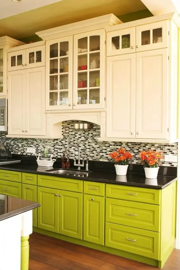
This kitchen feels like sunshine with a splash of matcha. The lime green lowers bring energy right away, while the cream uppers calm everything down. It’s playful, but still balanced. Green naturally signals freshness and growth, and when it leans lime, it adds a confident, slightly daring edge.
The key to keeping it stylish instead of overwhelming comes down to balance. A black countertop anchors the brightness, and a neutral backsplash adds texture without competing for attention. The contrast also makes the space feel taller and more open. If full lime feels like too much, try muted chartreuse or olive — you’ll still get that lively feel, just softened.
Style tip: Natural light makes this combo shine. Lime green especially comes alive during the day and keeps the kitchen feeling upbeat even when the sun goes down.
Warm Taupe + Charcoal Gray = Grown-Up Calm.
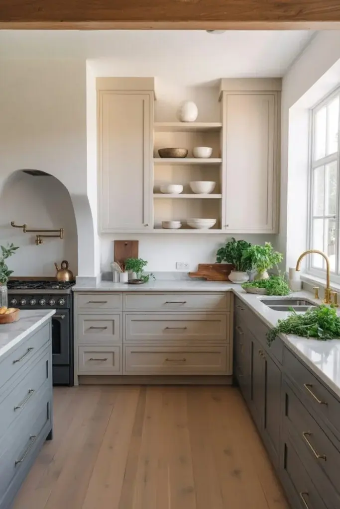
This pairing doesn’t shout — it quietly settles in. Taupe uppers bring warmth and approachability, while charcoal gray lowers ground the space with a steady, confident feel. It’s sophisticated without feeling formal.
Gray tends to create stability, and taupe softens it with warmth. Together, they feel intentional but relaxed. Matte finishes work especially well here, keeping everything understated. Add brass or champagne-gold hardware and suddenly the whole kitchen feels quietly luxurious.
Lighting matters more than you might expect. Warm, diffused light enhances taupe’s cozy undertones, while natural light reveals the depth in charcoal. This palette works best when texture does the heavy lifting — think stone counters, ceramics, and woven details. Keep clutter minimal so the calmness isn’t lost.
Oak Island + White Cabinets for Fresh Contrast
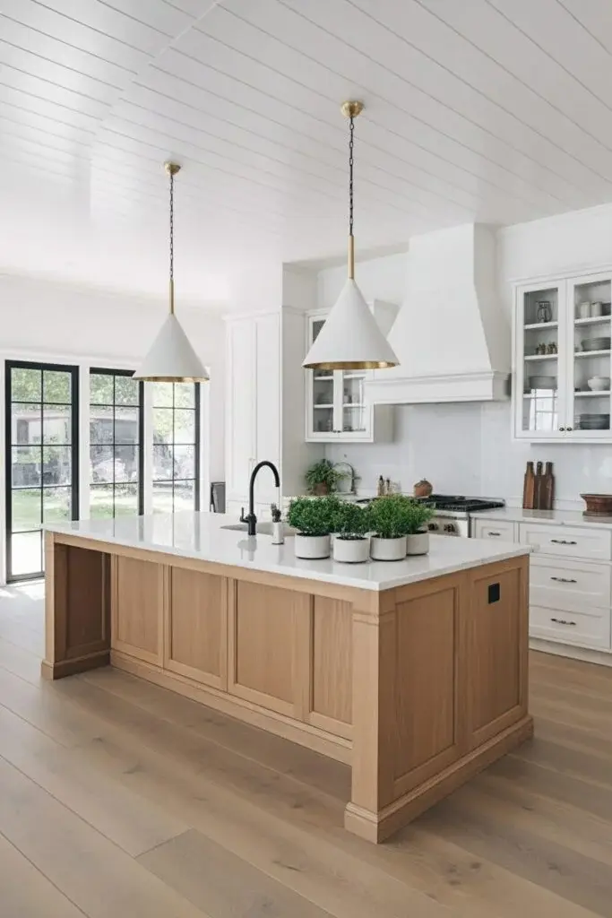
This one feels like slow Sunday mornings. The oak island brings warmth and texture, while white cabinets keep everything bright and open. It’s simple, but never boring.
Oak naturally softens the crispness of white, preventing that overly sterile look modern kitchens sometimes fall into. The trick is focusing on materials — matte white paint, marble or quartz counters, and subtle brass accents. A few black touches can add depth without overwhelming the palette.
This combination fits beautifully in Scandinavian or modern farmhouse kitchens where comfort and simplicity meet. Style tip: layer textures instead of adding more colors — linen stools, wooden boards, woven baskets. That’s what keeps it interesting.
Olive Green + Natural Wood for Rustic Harmony
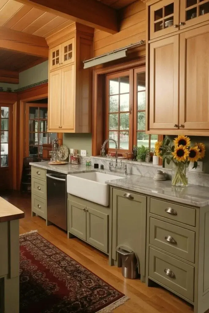
There’s something instantly comforting about olive green paired with natural wood. The green lowers ground the space, while wood uppers add warmth that feels organic and relaxed.
The secret is keeping both tones in the same temperature family. Warm olive works best with honey-toned wood, while cooler olives pair nicely with lighter, ashier finishes. Marble or light gray countertops brighten things up, and brushed metal hardware adds just enough shine.
With natural light, olive subtly shifts throughout the day, which gives the kitchen depth without needing more color. Style tip: mix finishes — matte cabinets with glossy backsplash tiles create dimension and keep the look from feeling too rustic.
Navy Blue + White: Bold Yet Balanced
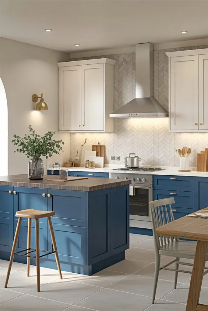
This pairing has become a favorite for a reason. Navy base cabinets add depth and structure, while white uppers keep everything feeling open. It’s bold, but still timeless.
Navy naturally grounds the space, and white reflects light, making the kitchen feel larger. To keep it from leaning too nautical, introduce warm metals like brass or gold, or add wood accents for softness. Warm lighting also helps bring out the richness of the blue.
For the best visual balance, keep darker tones below eye level. It creates a grounded feel while letting the white cabinets draw the eye upward. If you’re unsure, start with a navy island first — it’s a low-risk way to try the look.
Cherry Wood + Cream Cabinets for Warm Vintage Appeal
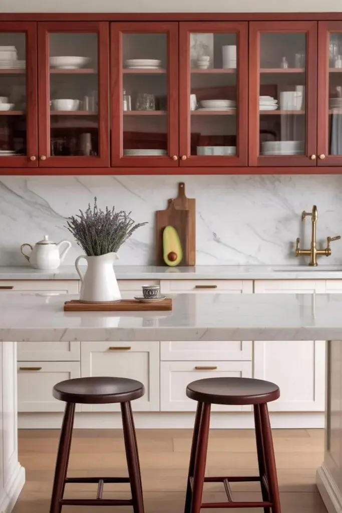
Cherry wood and cream together feel quietly nostalgic. The rich reddish tones of cherry add depth, while cream cabinets lift the space and keep it from feeling heavy. It’s warm, elegant, and a little timeless.
Cherry develops a deeper glow over time, which makes this pairing age beautifully. Cream reflects light and softens the richness. The trick is keeping accessories simple — brushed bronze or antique brass hardware ties everything together without clutter.
Style tip: checkered flooring or a subtle marble backsplash adds a gentle vintage touch without overwhelming the palette.
Blush Pink + White Cabinets = Modern Romance
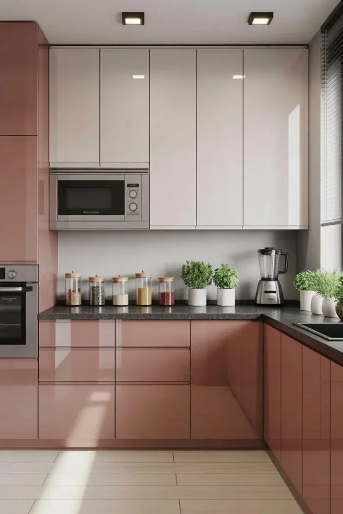
Blush pink can be surprisingly sophisticated. Paired with white uppers, it feels soft, modern, and just a little unexpected. The pink adds warmth, while white keeps everything light and airy.
Blush tones tend to create a calm, welcoming atmosphere. With white above, the color stays subtle instead of overpowering. Keep styling simple — quartz countertops, minimal hardware, and clean lines work best.
Lighting makes a big difference here. Natural light enhances the softness, while warm LEDs bring out cozy undertones at night.
Style tip: add texture instead of more color — fluted tiles or woven seating keep things interesting.
Olive Green + White Cabinets for Fresh Classic Charm
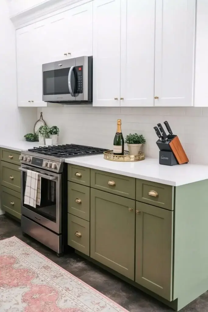
This combination feels timeless without feeling dated. Olive lowers ground the kitchen in earthy comfort, and white uppers keep things bright and balanced.
Olive brings calmness, while white prevents the space from feeling heavy. Brass or muted gold hardware works beautifully here, and a neutral backsplash keeps the look clean. The idea is restraint — let the color pairing do most of the work.
Style tip: woven textures like rattan stools or linen curtains soften the overall look and add warmth.
Deep Red + Cream Cabinets for Cozy Boldness
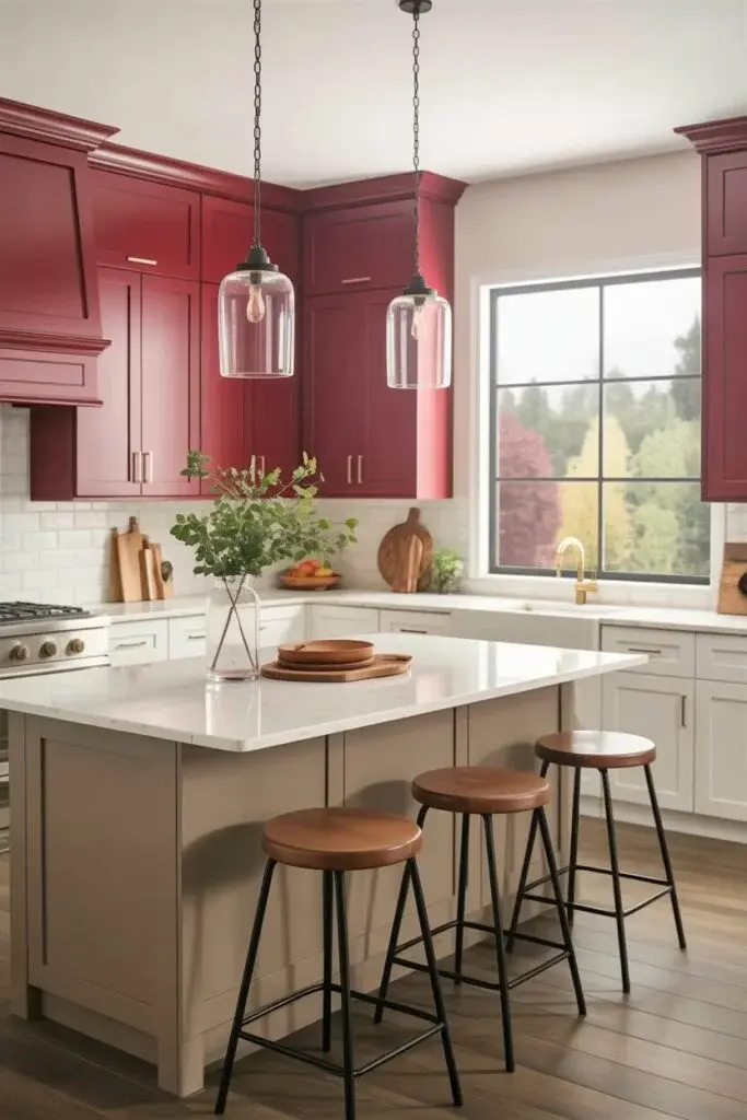
Deep red is bold, but when paired with cream, it becomes warm instead of overwhelming. The red adds richness and personality, while cream balances everything with softness.
Red naturally energizes a space, and cream keeps it grounded. Gold hardware or aged copper accents enhance the warmth, while light countertops prevent the palette from feeling too heavy.
This duo looks especially inviting under warm lighting — pendant lights or soft under-cabinet glow work beautifully. Style tip: keep décor minimal and let the cabinets take center stage.
Where Contrast Creates Timeless Character.
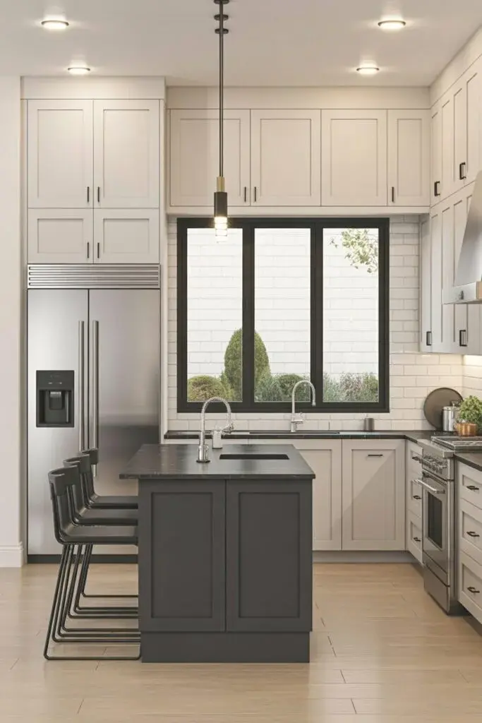
Two toned kitchens work because they embrace contrast without feeling chaotic. Light and dark, warm and cool — when paired thoughtfully, they create depth that a single color often can’t achieve.
That’s also why the trend keeps sticking around. It adapts easily. You can add dimension to a small kitchen, define zones in an open layout, or simply make cabinetry feel more custom. It’s subtle, but impactful.
If you’re planning a refresh, don’t be afraid to mix things up. Sometimes the right combination changes the entire feel of a kitchen. And when it works, the space doesn’t just look better — it feels better too.


