
Dorm rooms don’t exactly come with personality built in. Most of them feel pretty plain at first—same walls, same layout, same everything. But color can change that faster than you’d expect.
You don’t need to paint walls or break any dorm rules either. A few well-chosen pieces—bedding, pillows, rugs—can completely shift the mood of the space.

If you’re trying to make your room feel a bit more like yours, these color ideas are a good place to start. :contentReference[oaicite:0]{index=0}
1. Blush Pink and Warm Gray
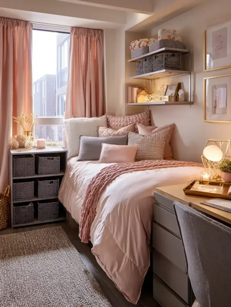
This combination feels soft without being overly sweet. The gray keeps things balanced, while blush adds warmth.
2. Navy Blue with Coral Accents
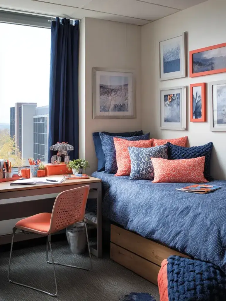
Navy creates a cozy base, and coral brings in a bit of energy so it doesn’t feel too heavy.
3. Sage Green and Cream
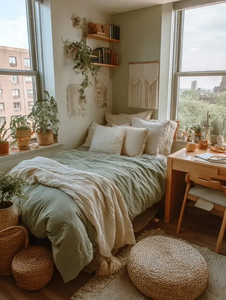
If you want something calm and easy to live with, this pairing works well. It feels relaxed without being dull.
4. Mustard Yellow and Charcoal Gray
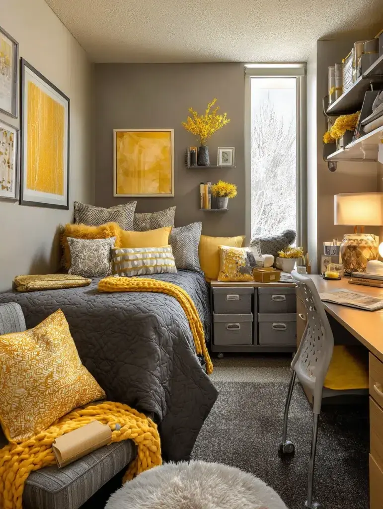
A bit more contrast here—yellow adds brightness, while charcoal tones things down.
5. Lavender and White
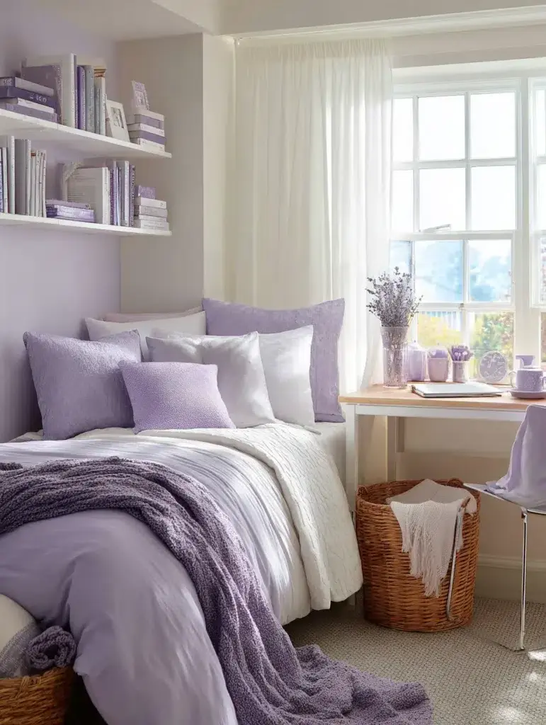
This one leans softer and more airy. It works especially well in smaller rooms.
6. Terracotta and Cream
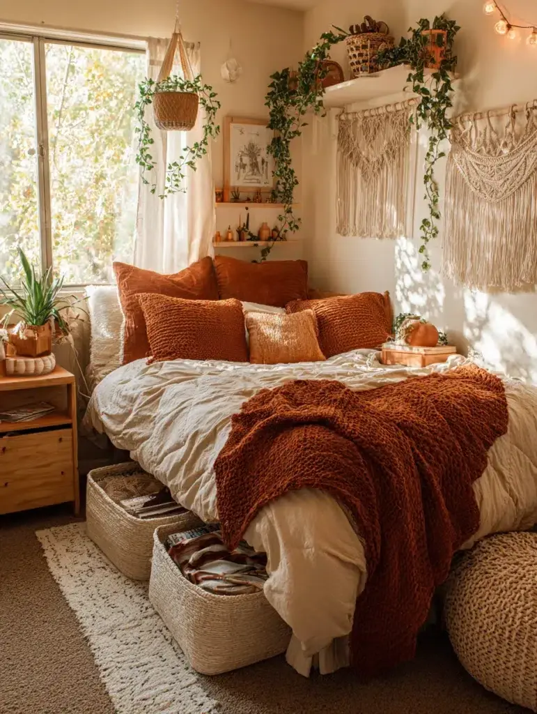
Terracotta brings warmth in a more grounded way. It feels a bit more natural than brighter colors.
7. Dusty Rose and Gold
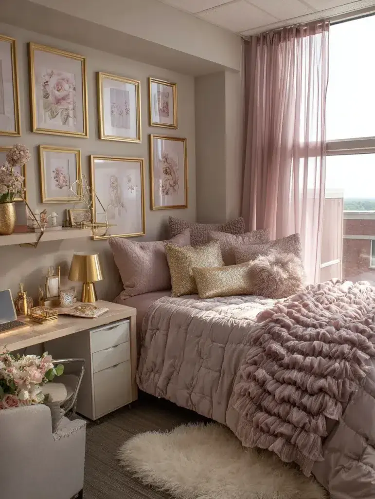
This pairing adds a slightly polished look without trying too hard.
8. Teal and Copper

Teal adds depth, and copper gives it a bit of warmth. It’s a good mix if you want something a little richer.
9. Soft Blue and Warm Beige
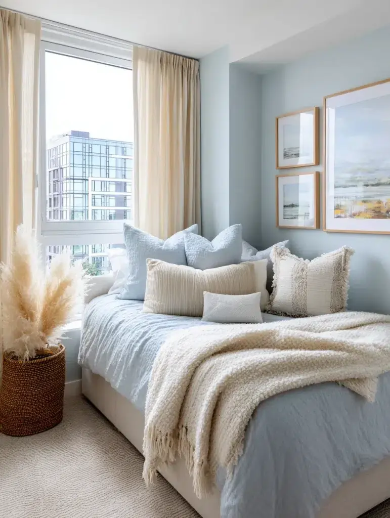
This one feels light and easy. It’s simple, but it works in almost any space.
10. Burgundy and Gray
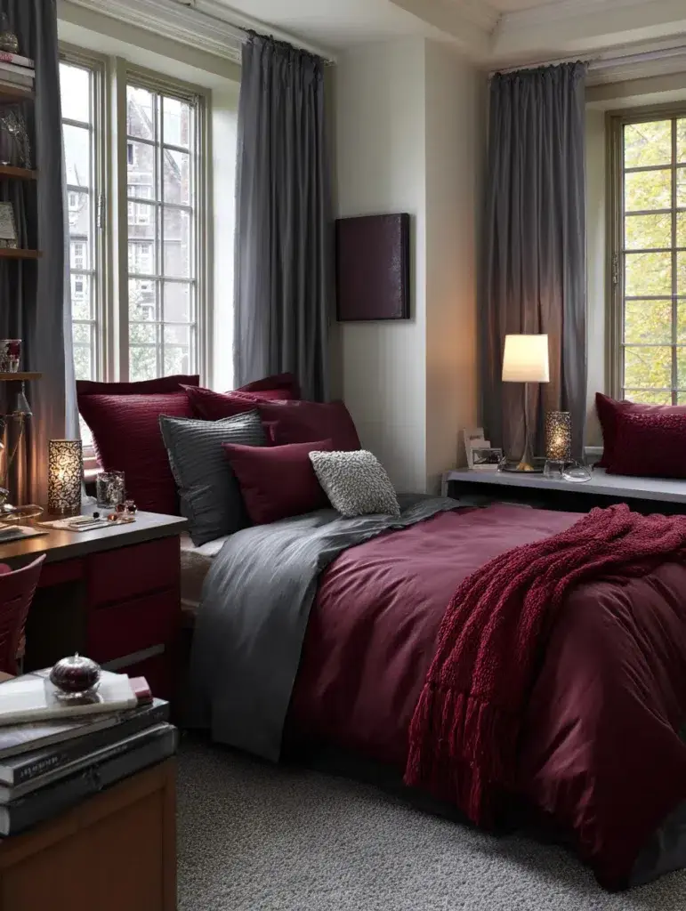
If you prefer something a bit moodier, this combination adds depth without feeling too dark.
11. Peach and Mint Green
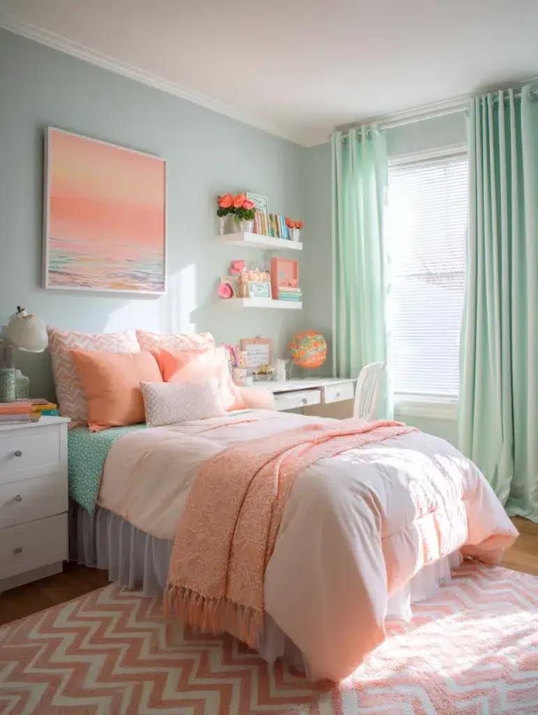
These softer tones keep things light but still add personality.
12. Chocolate Brown and Ivory
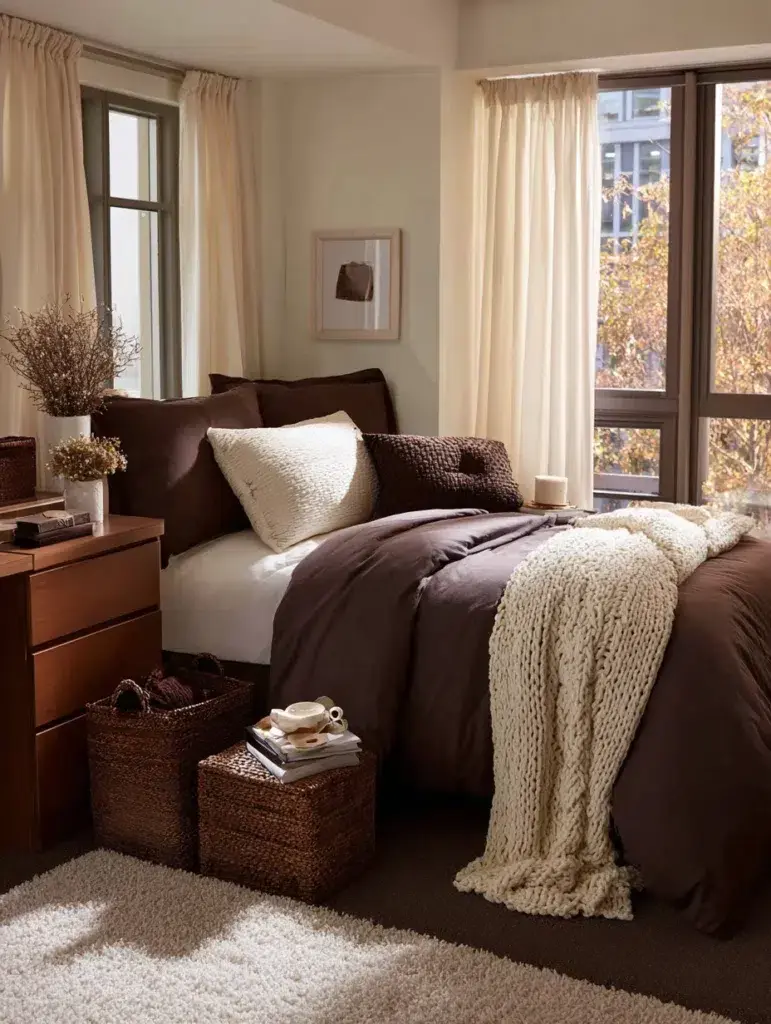
This pairing feels warm and grounded—especially nice if you want a cozier setup.
13. Mauve and Charcoal
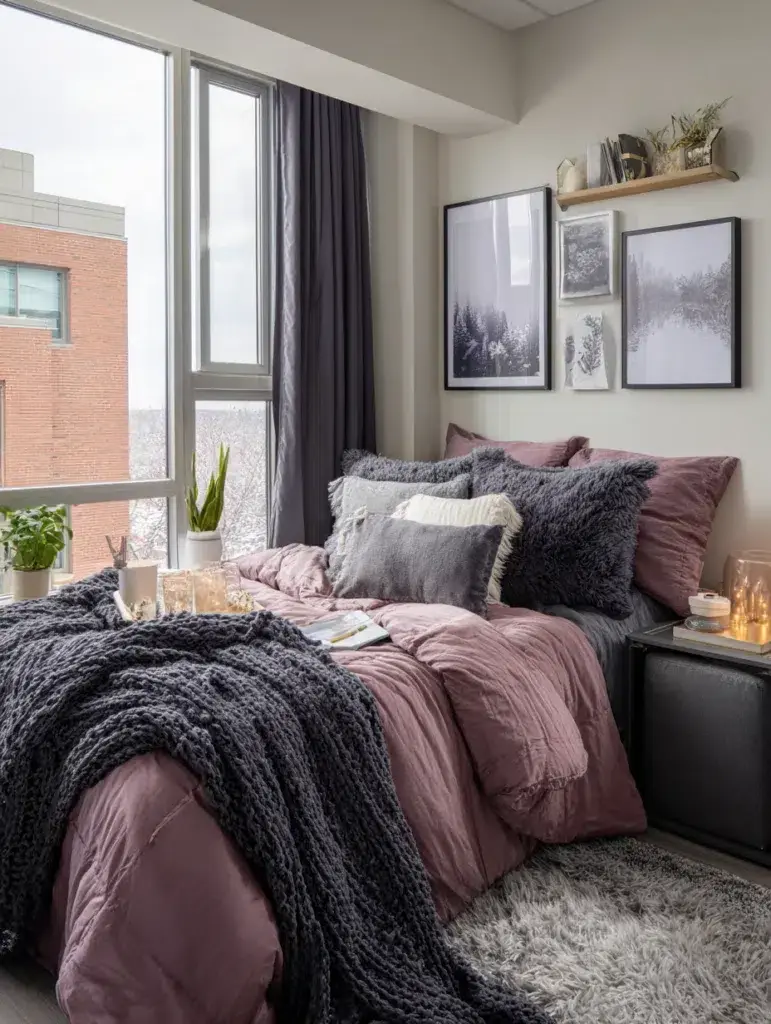
A softer take on darker tones. It adds color without being too bold.
14. Sky Blue and Soft Yellow

This combination feels bright but still easy to look at every day.
15. Forest Green and Tan
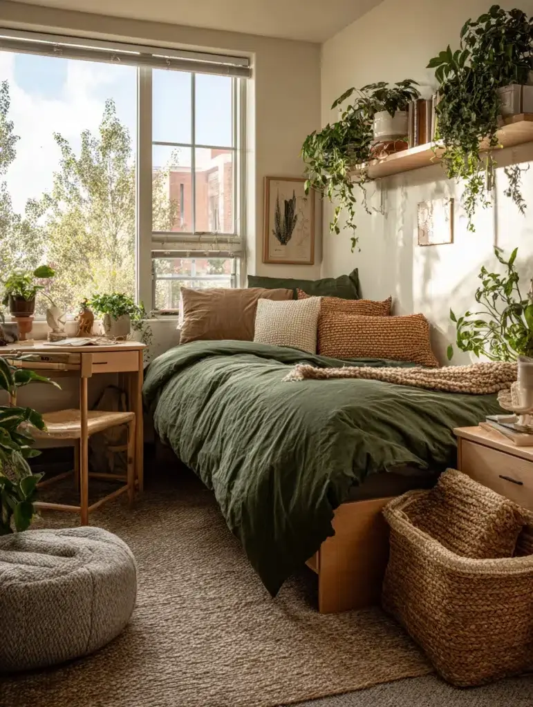
It leans a bit more natural and earthy, especially if you like a calmer vibe.
16. Lilac and Silver
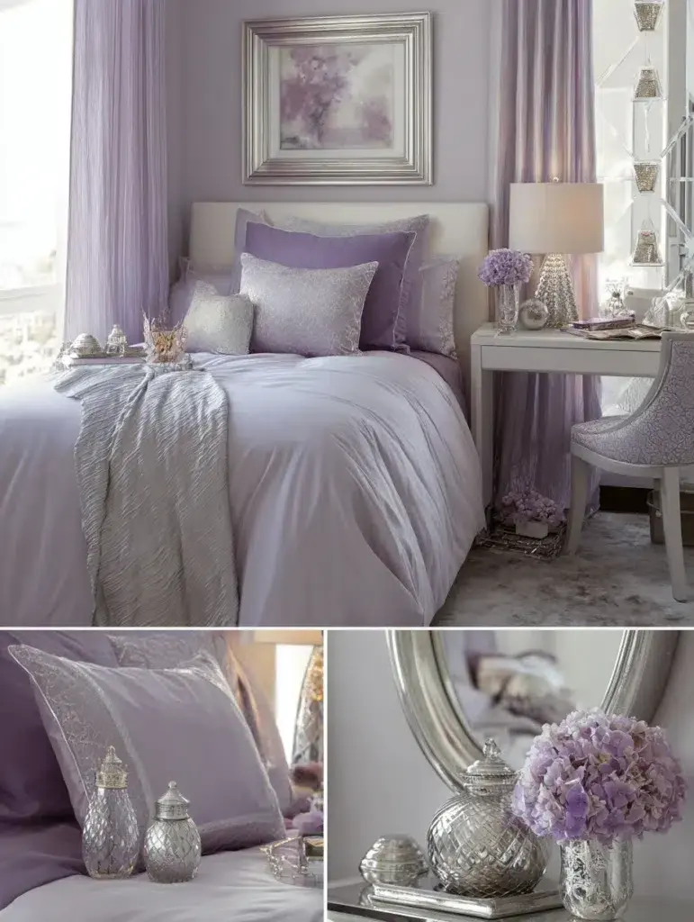
A softer palette with a bit of shine—simple but still noticeable.
17. Burnt Orange and Cream
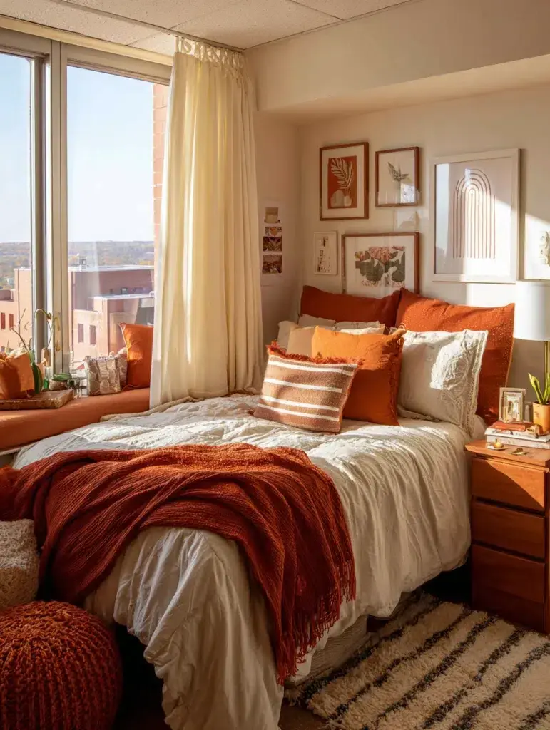
Warm and a little bold, but still easy to balance with lighter tones.
18. Slate Blue and Blush
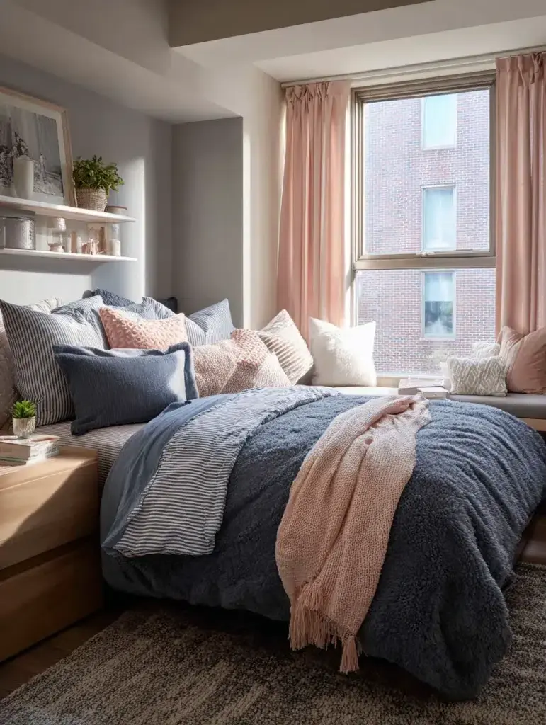
This one sits somewhere in the middle—calm, but not too plain.
19. Jade Green and Gold
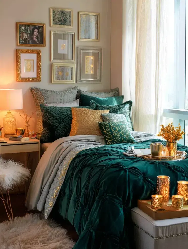
Richer tones that add a bit more depth to the space without overwhelming it.
20. Coral and Turquoise
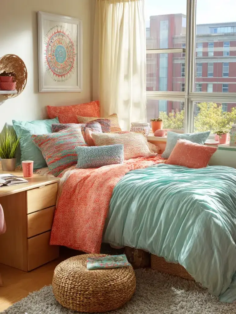
If you want something more energetic, this pairing definitely stands out.
21. Warm Gray and Marigold
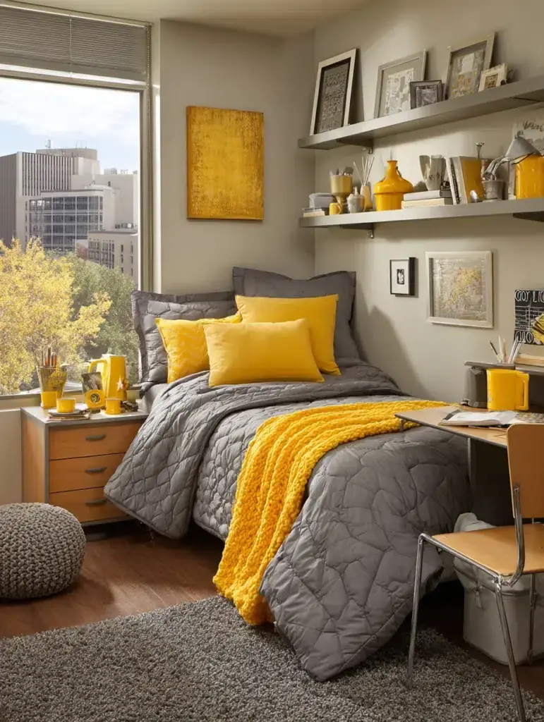
A simple base with a pop of color—it’s easy to adjust over time.
Final Thoughts
You don’t have to commit to one perfect palette right away. Try a few pieces, see how they feel, and adjust from there.
That’s the nice thing about decorating a dorm—it’s flexible. Over time, it naturally comes together into something that feels a lot more like your own space.