
Minimalist paint colors have a quiet impact. Instead of drawing attention, they shape how a space feels—calmer, lighter, and more intentional. Soft neutrals, gentle grays, and muted undertones create a backdrop that allows furniture, light, and texture to stand out without overwhelming the room.
If your home leans toward a clean, modern aesthetic, choosing the right subtle paint color can make a noticeable difference. The shades below are not just visually soft—they’re practical, versatile, and easy to live with across different rooms and lighting conditions.

These tones revolve around warm grays, soft beiges, and balanced neutrals that work well in U.S. homes where lighting conditions can vary throughout the day. Whether you are refreshing a single room or planning a full-home palette, these colors offer flexibility without sacrificing style.
Sherwin-Williams Neutral Paint Picks for a Calm Interior
Sherwin-Williams Repose Gray
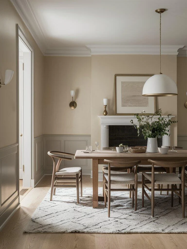
Repose Gray sits comfortably between warm and cool, making it one of the easiest neutrals to work with. Its subtle beige undertone keeps it from feeling cold, especially in rooms with natural light.
It works particularly well in dining areas and open living spaces where you want a relaxed, welcoming tone. Pair it with crisp white trim and light wood finishes to keep the room feeling fresh rather than flat.
Sherwin-Williams Mindful Gray
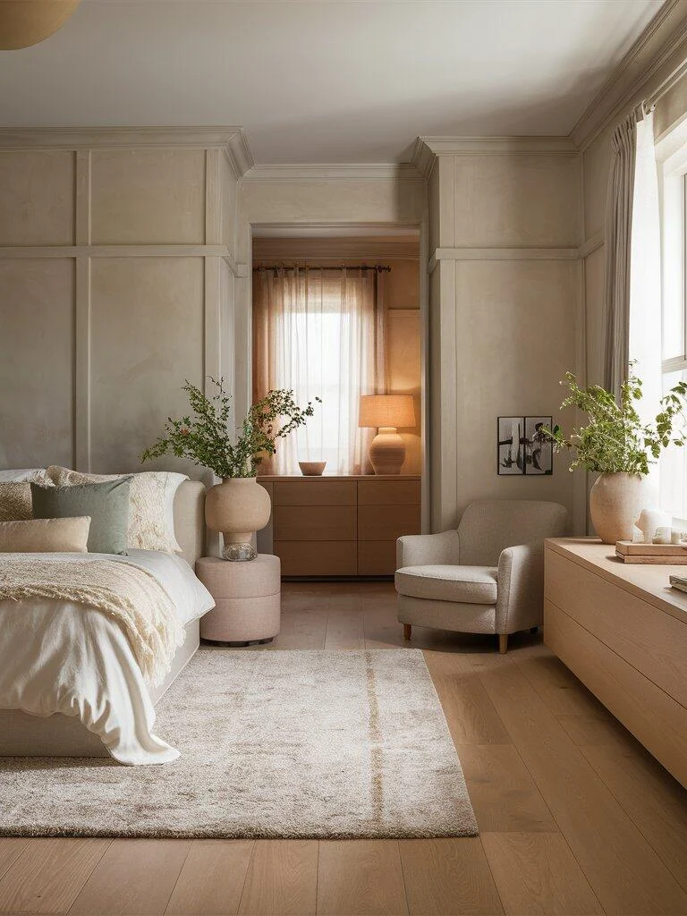
Mindful Gray leans slightly warmer, which makes it a strong choice for bedrooms or spaces meant for unwinding. It has enough depth to add character without making the room feel darker.
Layering soft textiles—like upholstered beds, neutral bedding, and warm wood nightstands—helps bring out its calming quality without overcomplicating the space.
Sherwin-Williams Guild Grey
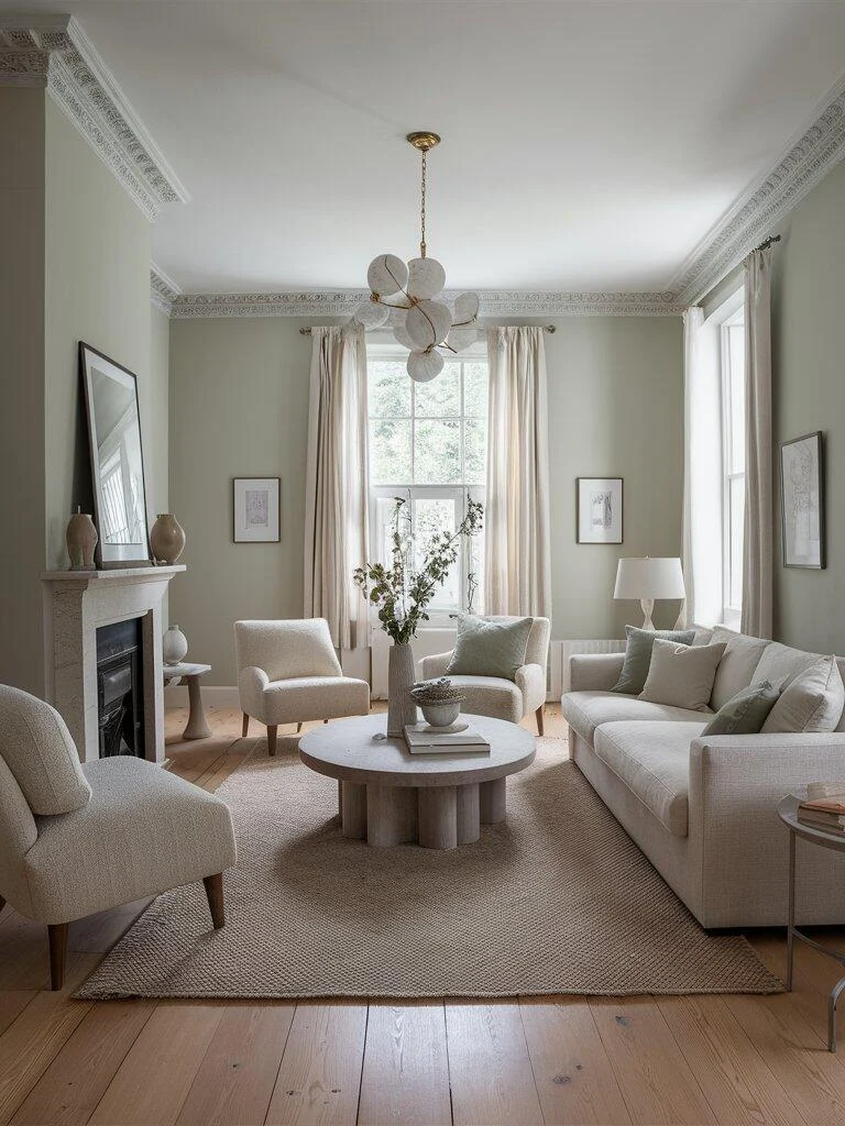
Guild Grey introduces a subtle hint of green into a classic gray base, giving it a slightly more organic feel. It tends to look especially good in living rooms where you want a grounded, comfortable atmosphere.
It pairs naturally with white upholstery, stone surfaces, and ceramic accents, creating a layered look that still feels restrained.
Benjamin Moore Minimalist Favorites That Work Across Rooms
Benjamin Moore Revere Pewter
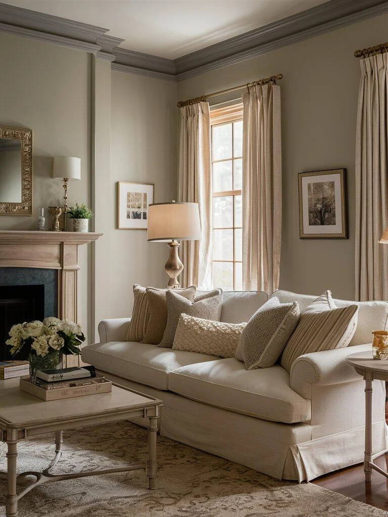
Revere Pewter has remained popular for a reason—it adapts well to different lighting conditions and bridges warm and cool tones with ease. This flexibility makes it a reliable choice for open-plan spaces.
It works equally well with modern furniture or more traditional pieces, especially when paired with wood tones and subtle metallic accents.
Benjamin Moore Balboa Mist
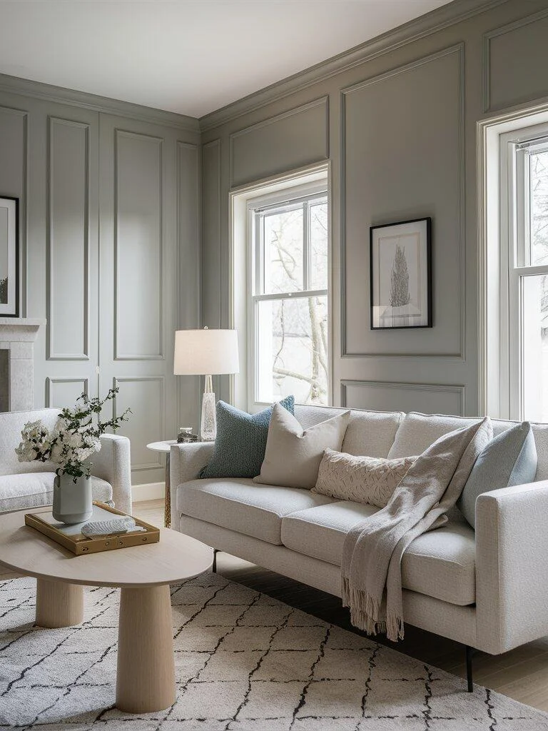
Balboa Mist is lighter and airier, making it a good option for rooms where you want to reflect as much light as possible. It softens a space without washing it out completely.
Adding texture through rugs, wall paneling, or layered fabrics helps prevent the room from feeling too plain while keeping the palette consistent.
Benjamin Moore Edgecomb Gray
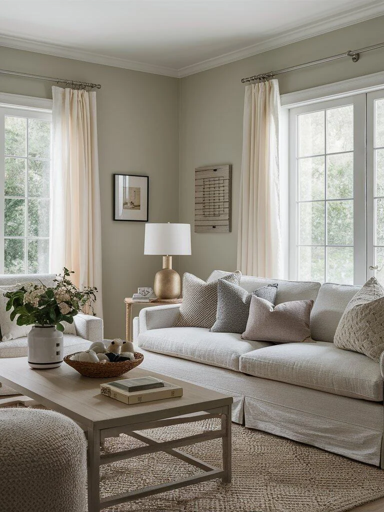
Edgecomb Gray leans warmer than many grays, with beige undertones that create a comfortable, lived-in feel. It’s often used in living rooms where you want a neutral backdrop that still feels inviting.
Natural materials—like rattan, wood, and linen—work especially well alongside this shade, helping maintain a relaxed, cohesive look.
Behr Neutral Paint Colors for Everyday Living
Behr Dolphin Fin
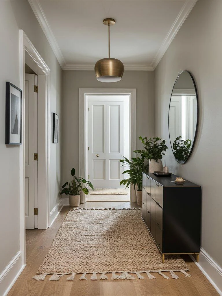
Dolphin Fin is a soft, warm gray that feels approachable and easy to use. It performs well in entryways and transitional spaces where you want a neutral that still has some presence.
Pairing it with darker wood tones and simple decor helps ground the space while keeping the overall look uncluttered.
Behr Campfire Ash
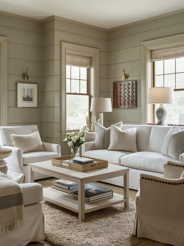
Campfire Ash has a slightly earthy undertone that gives it more character than a standard gray. It can help a smaller living room feel more balanced without making it feel enclosed.
Light furniture and natural textures—like wood and woven elements—keep the room from feeling too heavy.
Behr Silver Drop
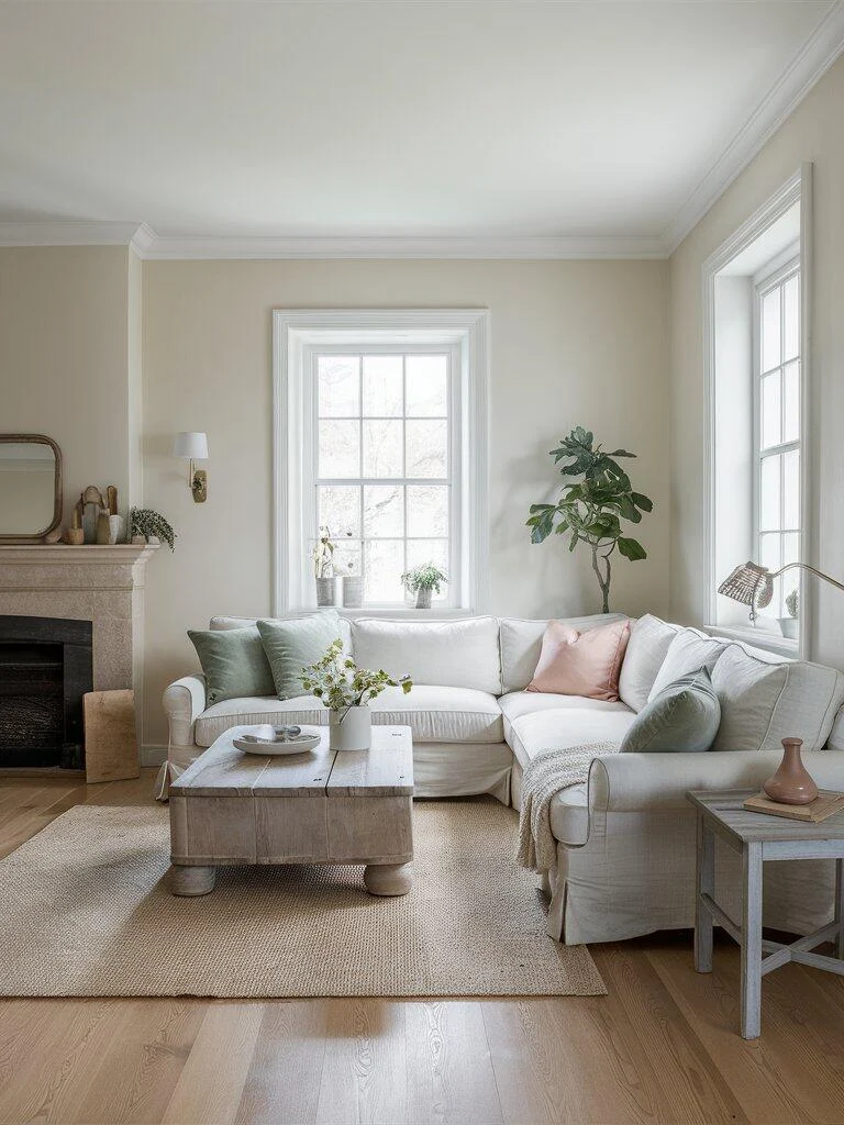
Silver Drop sits closer to a light beige, with a soft warmth that works well in family spaces. It keeps the room feeling bright while still offering more depth than plain white.
This shade works particularly well with layered neutrals and soft accent colors like muted greens or dusty pinks.
Farrow & Ball Subtle Shades for a Refined Look
Farrow & Ball Elephant’s Breath
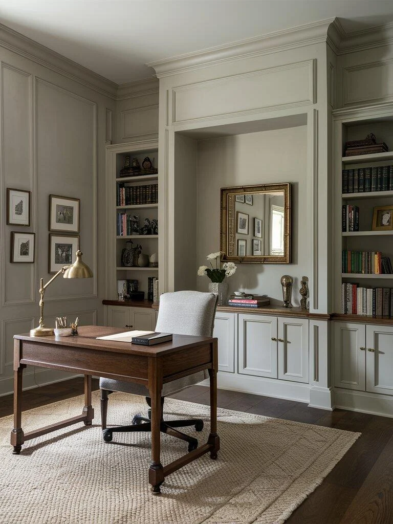
Elephant’s Breath is a mid-tone gray with warm undertones that give it a slightly richer feel. It works well in home offices or living areas where you want a bit more depth without going dark.
Using it across walls and built-ins can create a cohesive, enveloping look that feels calm rather than heavy.
Farrow & Ball Skimming Stone
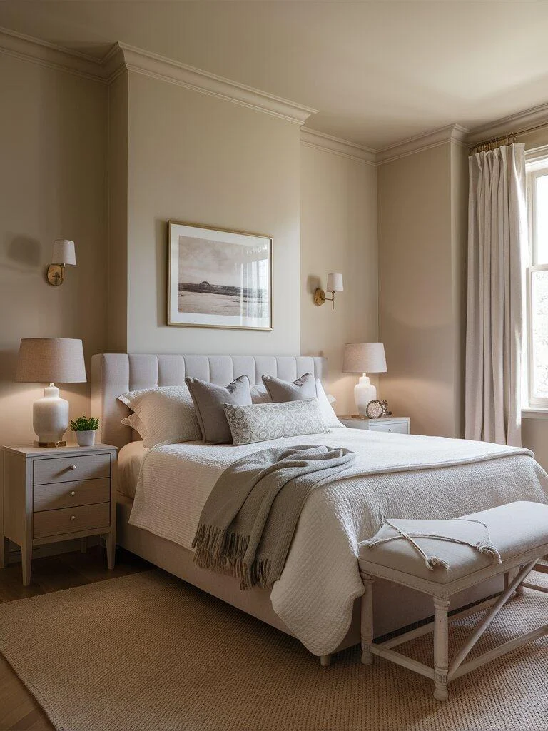
Skimming Stone is a soft, warm neutral that leans toward beige. It’s especially suited for bedrooms, where its gentle tone helps create a restful atmosphere.
Layering bedding, soft lighting, and simple decor allows the color to feel warm without becoming overly styled.
Farrow & Ball Purbeck Stone
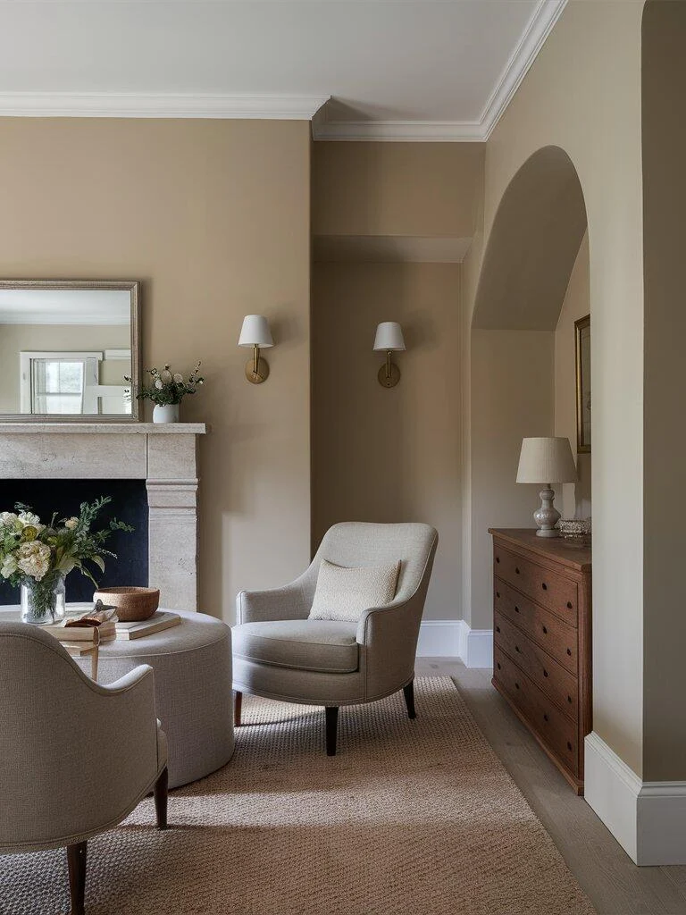
Purbeck Stone offers a balanced gray with subtle warmth, making it suitable for living rooms where you want something understated but not flat.
It pairs well with upholstered furniture, wood accents, and simple decorative pieces, creating a space that feels comfortable and cohesive.
Colors That Pair Well With Minimalist Paint Palettes
Pure White
White keeps the palette clean and helps highlight subtle variations in neutral tones. It works well for trim, ceilings, and larger furniture pieces.
Soft Gray
A lighter gray can add depth without disrupting the overall calm of a minimalist scheme. It’s often used in textiles or secondary walls.
Muted Pastels
Soft, desaturated colors—like pale blue or blush—introduce variation while keeping the space restrained. They work best in small accents rather than large surfaces.
Earthy Taupe
Taupe brings warmth and helps connect different neutral tones together. It’s particularly useful in flooring, upholstery, or larger furniture pieces.
Charcoal Black
Darker accents provide contrast and help define the space. Used sparingly—through lighting, frames, or furniture—they can give the room more structure.
Frequently Asked Questions
What is the safest minimalist paint color to use?
Soft greige tones like Repose Gray or Edgecomb Gray are some of the most adaptable options because they work in both warm and cool lighting.
Do minimalist colors make a room look bigger?
Yes, lighter and more neutral tones reflect more light, which can make a space feel more open and less crowded.
Should all rooms be painted the same neutral color?
Using variations of the same palette often works better. It keeps the home cohesive while still giving each room its own character.
How do I test a paint color properly?
Always test swatches on multiple walls and observe them throughout the day. Lighting changes can significantly affect how a color appears.
Final Thoughts
Minimalist paint colors are less about making a statement and more about creating a consistent, comfortable backdrop for everyday living. The right shade should feel easy to live with, adapt well to different lighting, and support the overall style of your home.
Start with one room, test a few options, and pay attention to how the color changes throughout the day. Once you find a tone that feels balanced, it becomes much easier to build the rest of your space around it.
Written by the Zeeshe Home Editorial Team, a blog focused on practical home décor ideas and inspiration.


