
A flower bed starts to feel polished when the color story is clear. Even simple planting can look far more intentional when the blooms relate to one another, repeat thoughtfully, and suit the mood of the space. That is the difference between a bed that feels scattered and one that looks composed from the sidewalk, patio, or kitchen window.
The good news is that a color-matched bed does not have to feel strict or overly formal. Some combinations are soft and romantic, others bright and cheerful, and a few are bold enough to become the focal point of the whole yard. The key is choosing a palette you genuinely like, then using plant height, bloom timing, and foliage texture to keep it interesting.

How to Plan a Color-Coordinated Flower Bed
The easiest flower beds usually begin with one clear decision: what mood do you want the planting to create? Soft pinks and whites feel gentle and classic. Purple and gold looks richer and more dramatic. White and green reads clean and calm. Once that mood is clear, the rest of the choices become much easier.
- Start with one main color family: pink, white, blue, purple, yellow, or a warm sunset range
- Add one supporting shade: this keeps the bed from looking flat
- Repeat colors in groups: repeated drifts usually look more designed than one-off plants
- Use foliage intentionally: green, silver, burgundy, and bronze leaves can tie the palette together
- Check bloom timing: the prettiest palette still needs flowers that overlap in season
It also helps to think about viewing distance. A bed seen from the street often needs bolder blocks of color, while a border beside a path can carry more delicate combinations and smaller flower details.
1. Pink and White Peony Border Ideas
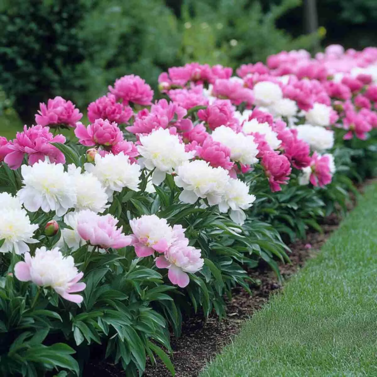
Pink and white peonies create one of the most timeless combinations for a flower border. The white blooms add lightness, while the pink keeps the bed from feeling too stark or bridal. Together, they read romantic without becoming overly sweet.
This works particularly well along front walks, formal entry planting, or any border you want to feel lush for late spring and early summer. Plant peonies in loose clusters rather than alternating them too rigidly. The effect should feel generous, not striped.
Because peonies have a relatively short bloom window, the bed looks even better if you underplant with tidy green edging or include later foliage plants that keep the border looking full after the flowers fade.
2. Lavender and Silver Herb Garden Combinations
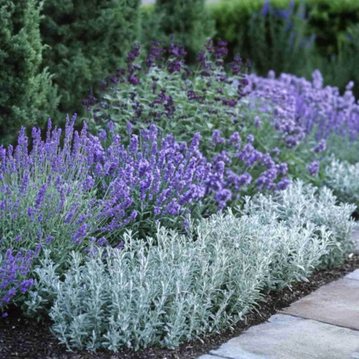
Lavender and silver foliage make a bed feel calm, sun-washed, and quietly elegant. It is one of the easiest palettes for creating a relaxing planting near seating areas, gravel paths, or Mediterranean-style borders.
The reason it works so well is contrast without noise. Purple flowers provide just enough color, while silver leaves from plants like artemisia, lamb’s ear, or dusty miller soften the whole planting and catch the light beautifully.
This combination is most convincing in a sunny spot with sharp drainage. Keep the shapes simple and let the repetition do the work.
3. Yellow and Orange Marigold Beds for Instant Warmth
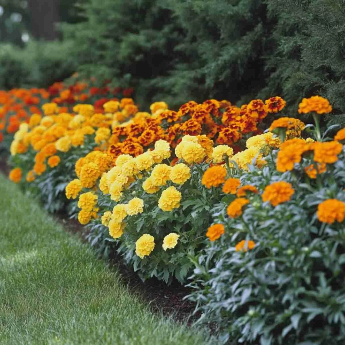
Yellow and orange marigolds are bright, cheerful, and especially effective when you want a flower bed to read clearly from a distance. These colors are close on the color wheel, which is why they look energetic together rather than jarring.
This is a strong option for edging front-yard beds, defining a vegetable garden border, or filling a sunny patch that needs easy seasonal color. Wide drifts look better than scattered dots. When planted closely, marigolds form a richer carpet of warm color that feels deliberate instead of sparse.
Dark green foliage or simple edging helps stop the palette from feeling too loud.
4. Blue and White Hydrangea Corner Ideas
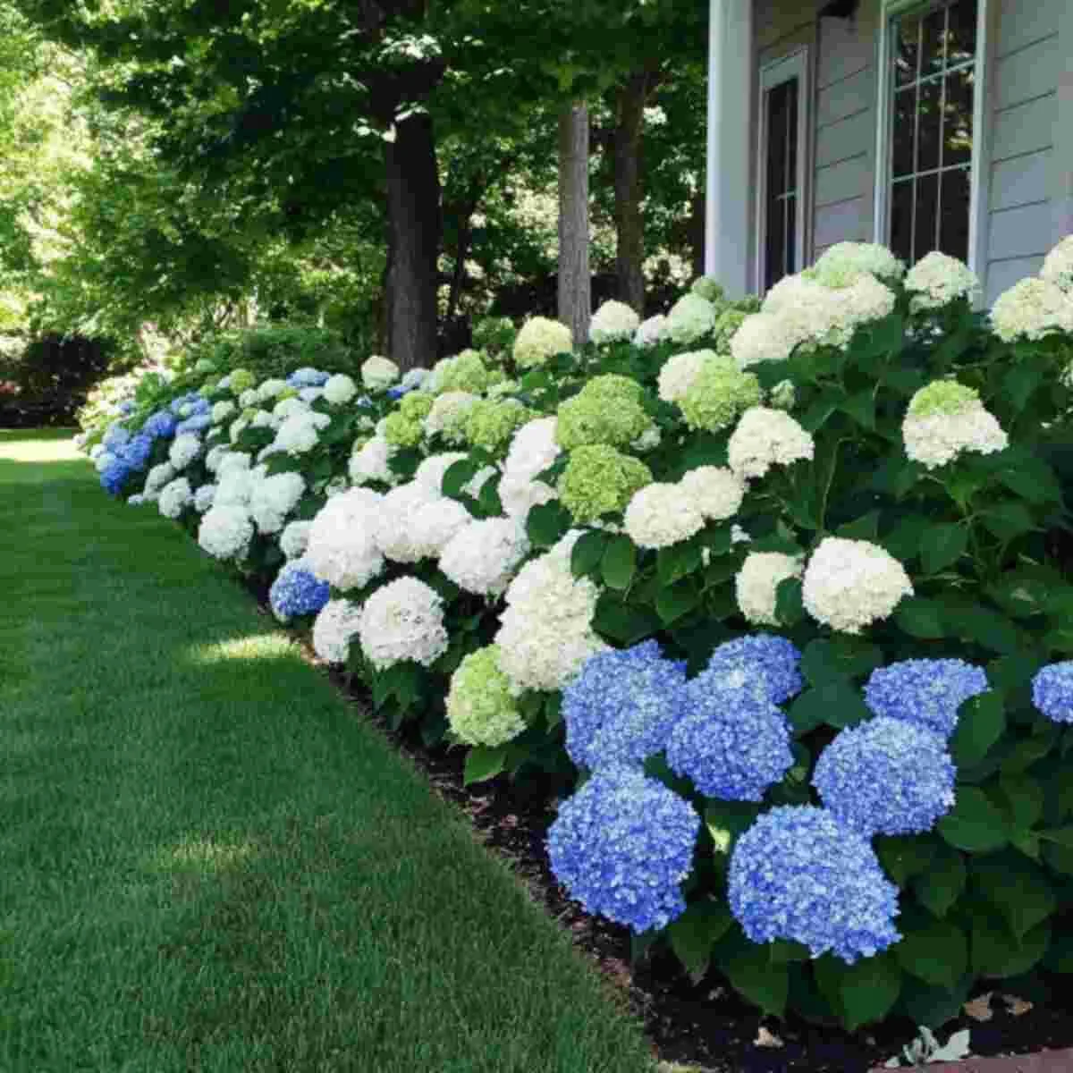
Blue and white hydrangeas create a cooler, more restful kind of flower bed. It is a combination that feels fresh in summer and especially good in corners that need a softer presence rather than a burst of hot color.
The blue brings depth, while the white keeps the planting luminous. This works beautifully beside pale stone, gray-painted fencing, or shaded patios where the flowers can brighten the space without feeling too intense.
Cluster hydrangeas rather than spacing them too evenly, and give them enough room to mature. A hydrangea corner looks best when the planting feels abundant.
5. Red and Pink Rose Beds With Classic Contrast
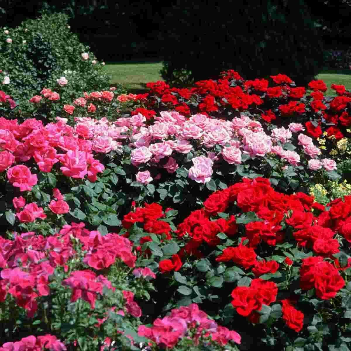
Red and pink roses make a bed feel lush, layered, and full of old-garden romance. The red adds depth and richness, while the pink softens the overall effect and prevents the display from feeling too formal.
This pairing works especially well when the tones are separated in repeating groups rather than mixed too randomly. It gives the eye somewhere to rest and makes the bed look more intentional from a distance.
If the planting feels too saturated, a few cream or white flowers can act as a buffer and lighten the whole composition.
6. Purple and Gold Perennial Beds That Stand Out
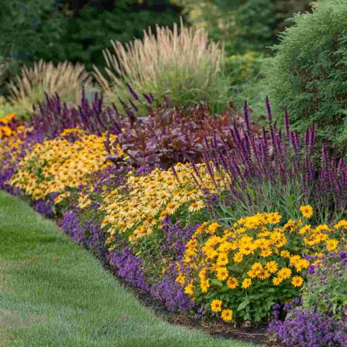
Purple and gold is one of the most reliable high-contrast combinations in the garden. The cool richness of purple paired with warm golden yellow creates a bed that feels energetic and established at the same time.
It works particularly well in sunny borders where strong color reads best. Salvia, allium, or catmint can pair beautifully with coreopsis, rudbeckia, or other yellow-flowering perennials.
To keep the bed from looking patchy, repeat both colors across the planting instead of grouping all the purple on one side and all the gold on the other.
7. Soft Pastel Cottage Garden Flower Beds
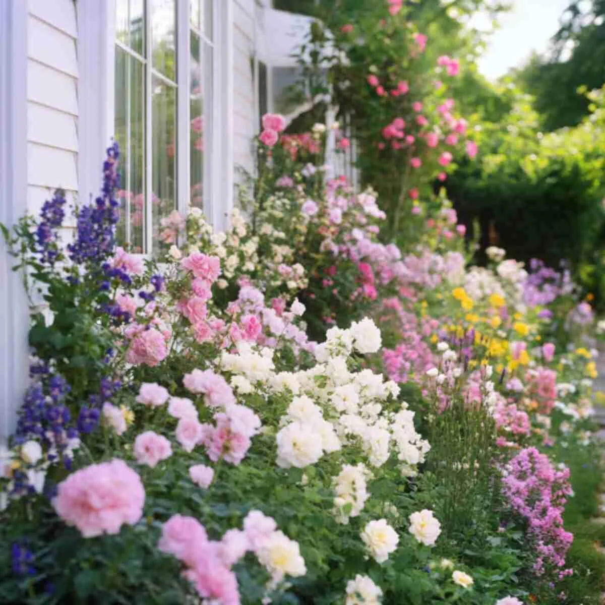
A pastel flower bed feels airy, relaxed, and gently layered. Blush pink, pale yellow, lavender, and soft blue can all live together successfully because none of them dominates too strongly.
This style suits cottage gardens, picket fences, curved beds, and informal borders where the planting is meant to feel full rather than sharply structured. The charm lies in the softness of the whole effect.
Keep the bed from becoming vague by using a few anchor plants with clear form and repeating the same pastel shades in several spots instead of introducing too many one-off colors.
8. White and Green Minimalist Flower Bed Ideas
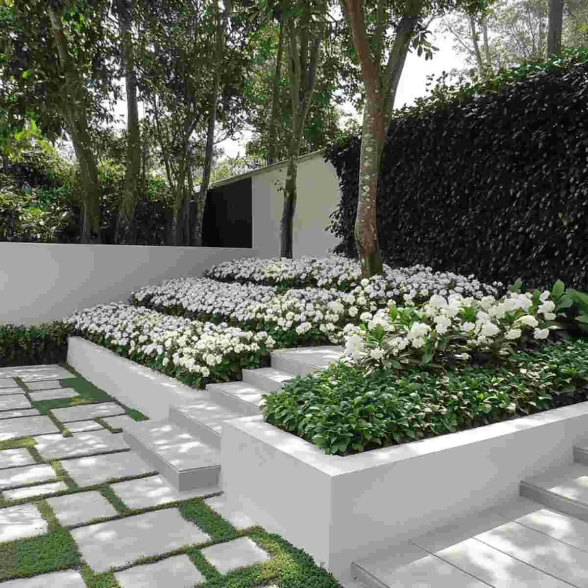
White and green is one of the cleanest palettes a flower bed can have. It feels modern, restrained, and fresh, but it only works well when the textures are varied enough to carry the design.
That is what makes this palette more interesting than it first appears. White flowers brighten the bed, but the structure comes from the foliage: broad leaves, upright stems, fine-textured grasses, clipped forms, or glossy shrubs.
This is particularly effective near contemporary homes, formal paths, or small gardens where a quieter palette helps the whole space feel more open.
9. Hot Pink and Purple Tropical Beds
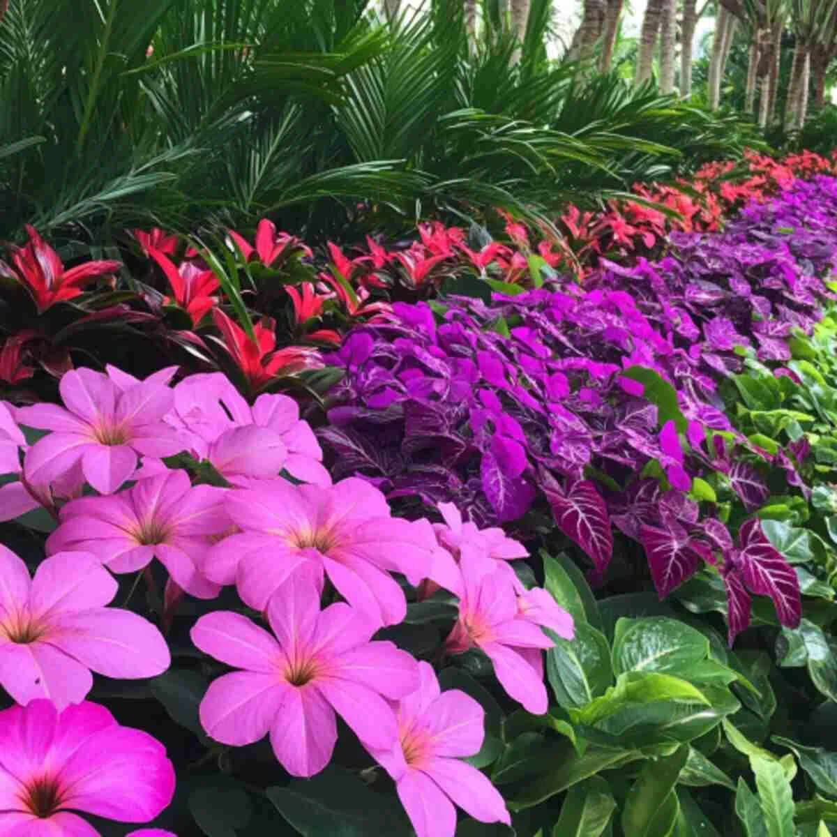
Hot pink and purple are not shy colors, which is exactly why they work so well in tropical-style planting. Together they create a lush, energetic bed that feels bold without becoming completely chaotic.
The key here is to support the flowers with foliage that feels equally strong: broad leaves, glossy textures, or deep green backgrounds that can handle the intensity. This helps the palette feel rich rather than scattered.
Use this combination where you want a garden bed to be noticed immediately, especially in full sun or near an outdoor entertaining space.
10. Coral and Peach Summer Bloom Beds
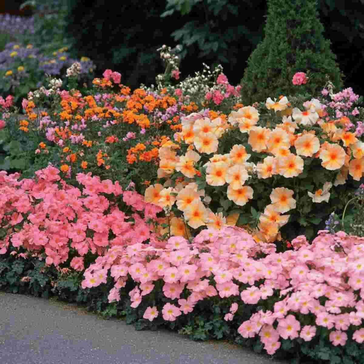
Coral and peach create a warm, flattering palette that feels summery without turning harsh. These shades are softer than red or orange but still strong enough to lift a sunny border and make it feel cheerful.
This combination is especially beautiful when paired with cream accents or softer green foliage. It reads warm and welcoming, which makes it a lovely choice near patios, front entries, or places where the bed is seen in evening light.
For the best effect, keep the color palette fairly tight and let the warmth come from repeated tones rather than adding too many unrelated shades.
11. Monochromatic White Flower Beds
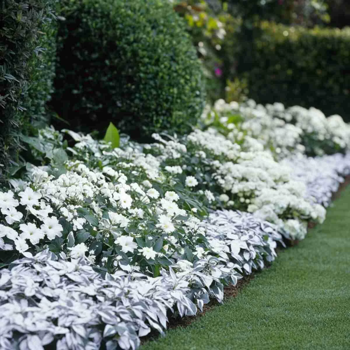
A flower bed built entirely around white blooms can feel surprisingly rich when the textures are varied. It is one of the most elegant ways to make a garden feel calm, bright, and quietly luxurious.
White also reflects evening light beautifully, which is why monochromatic white beds work so well near terraces, porches, or windows that are often viewed at dusk. They can make small spaces feel larger and more open too.
The secret is not color but contrast in form. Mix spires, rounded blooms, trailing edges, and different leaf shapes so the bed still feels layered.
12. Burgundy and Cream Autumn Borders
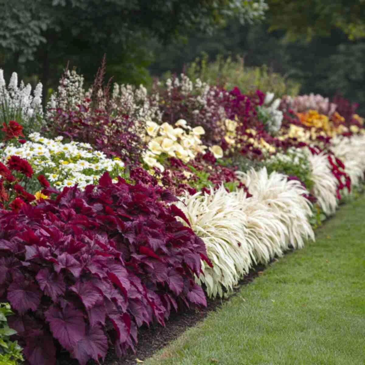
Burgundy and cream is a richer, moodier combination that feels especially strong in late summer and fall. The burgundy adds visual weight, while the cream stops the palette from becoming too dark or heavy.
This works beautifully along fences, boundary lines, or mixed borders that need a stronger seasonal finish. Bronze or deep green foliage supports the look particularly well and helps the planting feel more layered.
It is a useful palette if you want something that feels warm and sophisticated rather than bright and summery.
13. Blue and Yellow Pollinator Garden Ideas
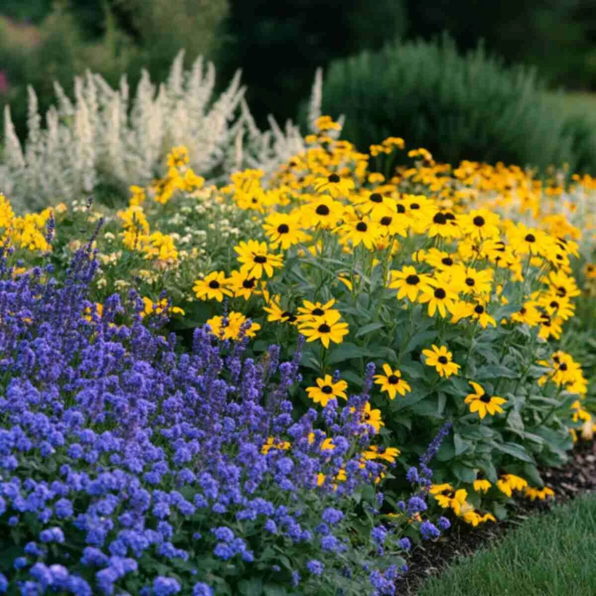
Blue and yellow is one of the most naturally balanced color pairings in the garden. The cool blue tones settle the planting, while yellow brings brightness and energy. Together they feel cheerful without becoming overwhelming.
It is also a strong choice for pollinator planting because many blue and yellow flowers are attractive to bees and butterflies. This makes the bed feel lively in more than one way.
Keep the display coordinated by planting in repeated clumps rather than scattering the colors randomly. Order makes the palette look stronger.
14. Red, White, and Blue Flower Bed Ideas
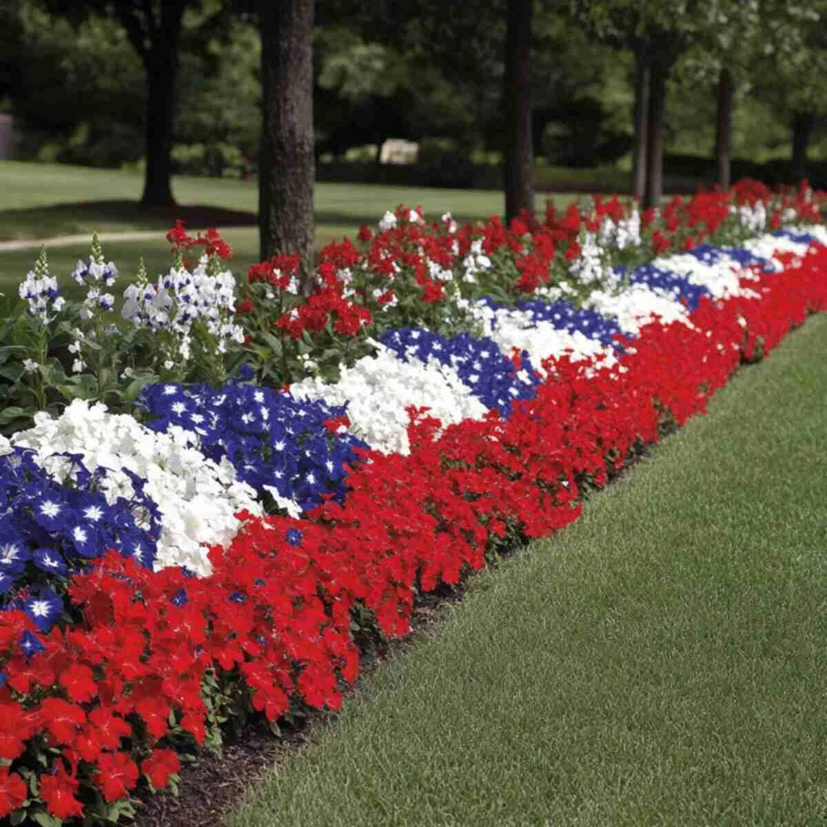
Red, white, and blue makes an immediate statement. It is bold, high-contrast, and especially suited to front yards, celebratory summer planting, or garden areas that benefit from a strong, graphic look.
The trick is spacing the colors thoughtfully. White works best as the bridge between red and blue, helping the whole planting feel clearer and less busy. Without that breathing room, the bed can quickly become visually noisy.
This is one of the most structured palettes on the list, so crisp edging and clear planting blocks help it look deliberate.
15. Sunset-Inspired Orange and Red Beds
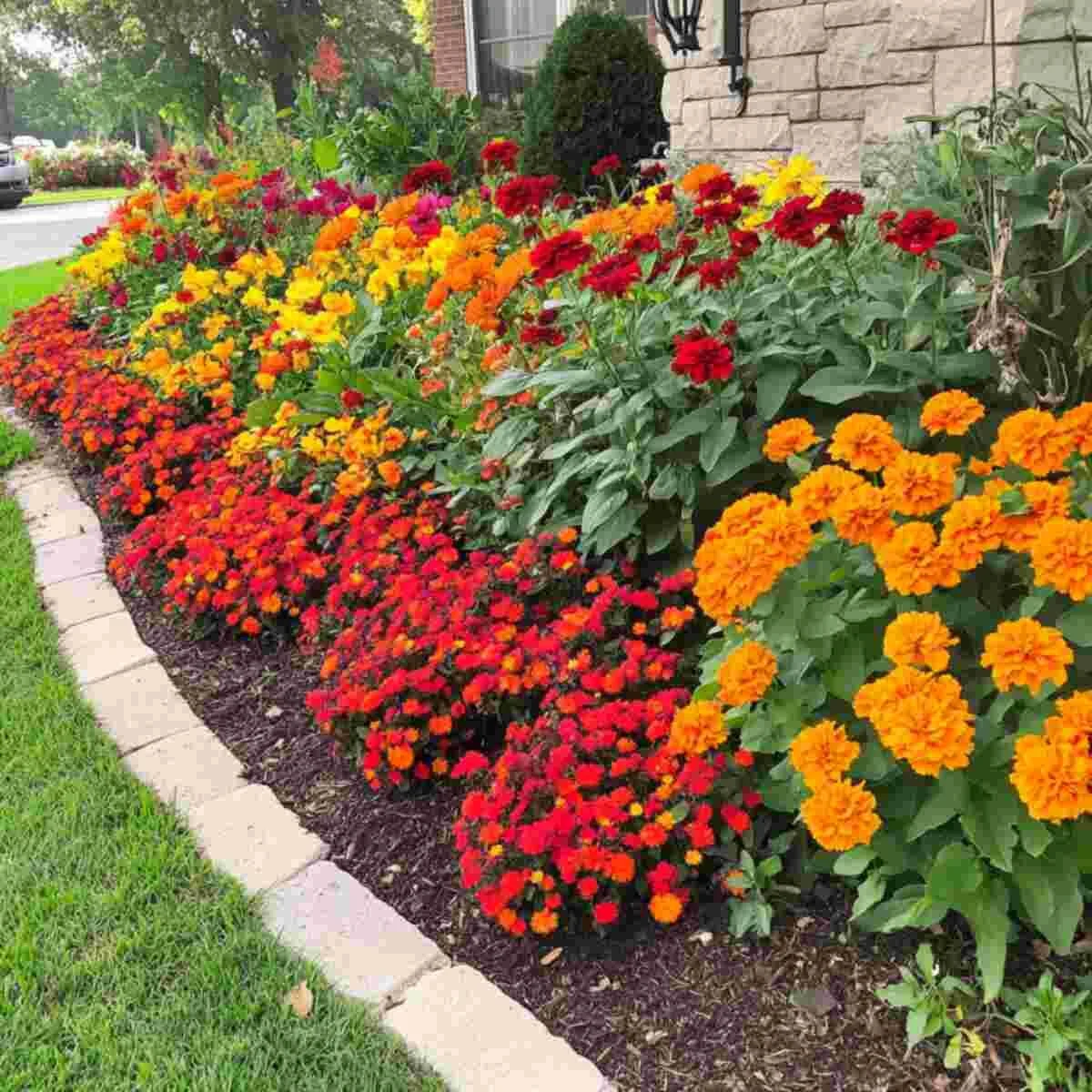
Orange and red create a bed that feels warm, glowing, and full of late-day energy. This combination is at its best in bright sun, where the richer tones can really show their depth.
It is a strong choice for garden beds that need impact from a distance or where the planting should feel vibrant and welcoming. Deep green foliage is especially helpful here because it gives the hot colors a darker frame to sit against.
This palette works best when the planting feels generous. Sparse planting can make strong warm colors look accidental rather than glowing.
16. Black and Deep Purple Dramatic Flower Beds
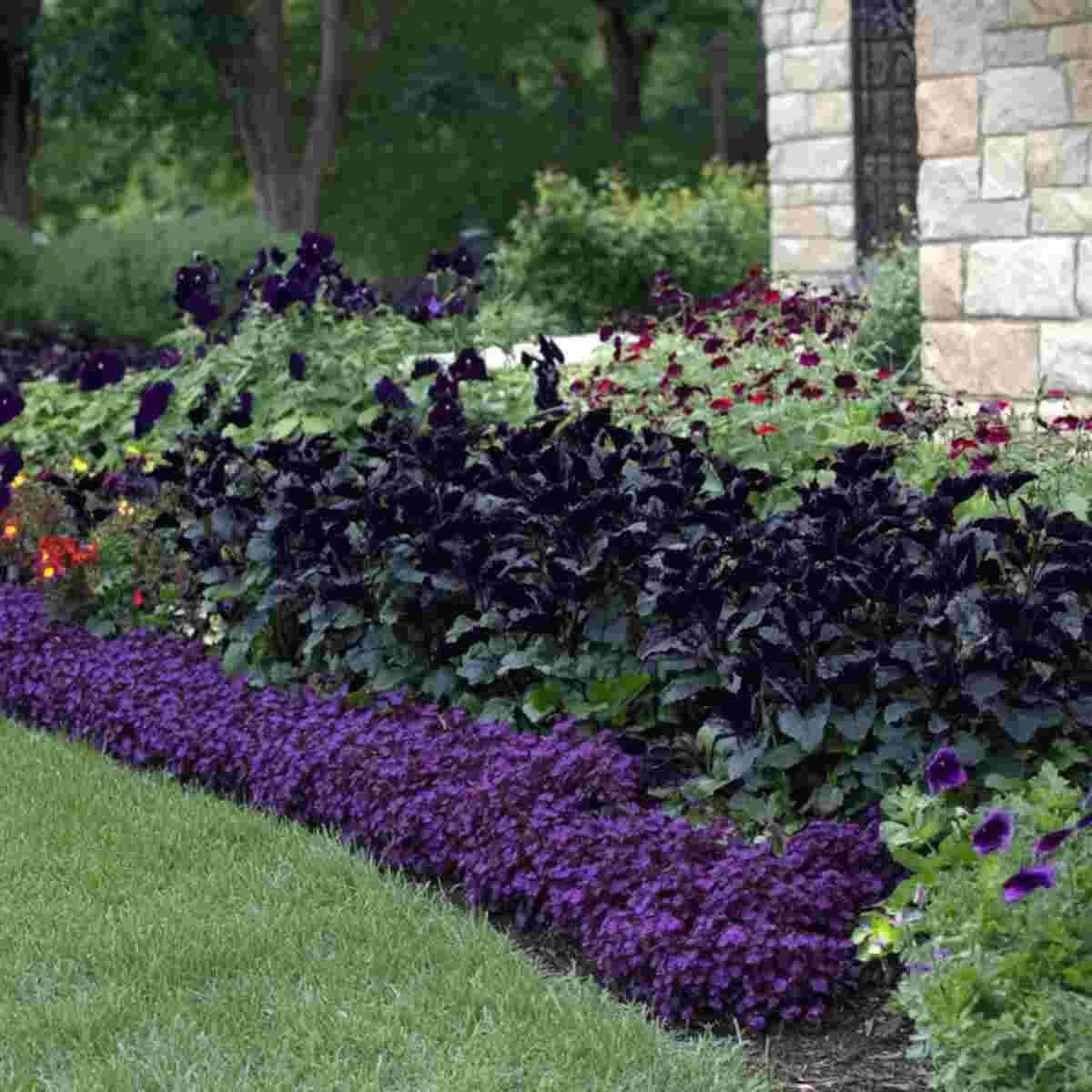
Black and deep purple create one of the moodiest and most memorable flower bed palettes. It feels dramatic, slightly theatrical, and especially striking against pale gravel, light paving, or white-painted edging.
This is not a subtle combination, but it can be incredibly elegant when the surrounding materials are kept simple. Silvery foliage is often useful here, adding just enough lift to stop the planting from feeling too dark.
Use this palette where you want a flower bed to feel distinctive rather than traditionally cheerful.
17. Rainbow Layered Flower Bed Ideas
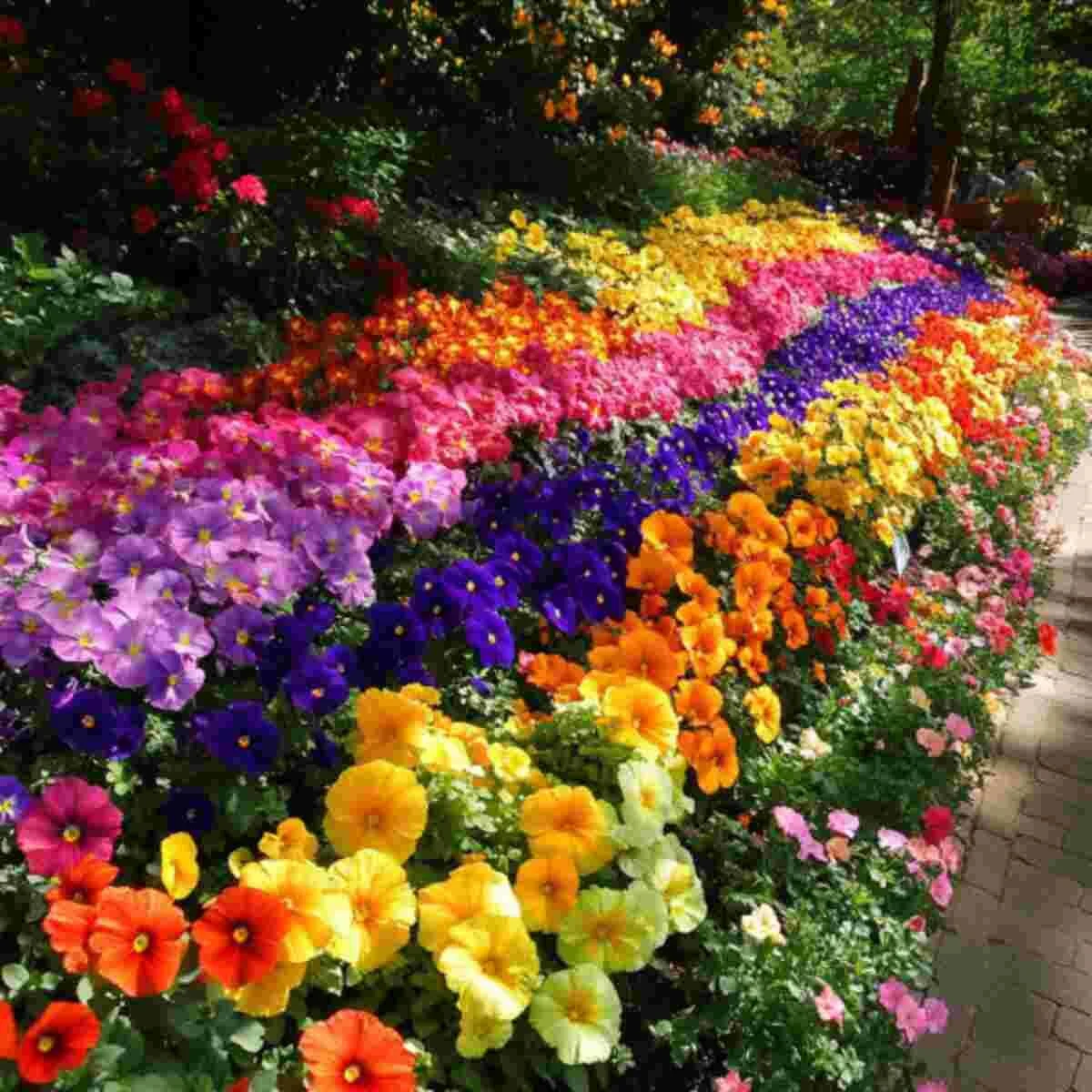
A rainbow bed can absolutely work, but only when the color order feels intentional. The most successful versions move from one hue to the next in a clear sequence, rather than mixing every bright flower together in the same space.
This creates movement without confusion. It also makes a multicolored bed feel joyful and organised instead of chaotic. The structure matters just as much as the color here.
For the cleanest result, think in bands or flowing sections and let the colors transition gradually across the bed.
Garden Design Tips for Matching Flower Colors
Color is only part of what makes a flower bed look coordinated. The shape of the planting, the timing of bloom, and the surrounding materials all influence how the palette reads.
- Repeat colors across the yard: repeating a shade in more than one bed makes the whole garden feel connected
- Use foliage as a bridge: green, silver, burgundy, and bronze leaves can help different bloom colors sit together more naturally
- Layer by height: taller flowers usually belong at the back, lower flowers near the edge, so every color can be seen
- Think seasonally: the bed should still make sense as different flowers come and go
- Choose the right scale: bold color blocks often suit larger beds, while delicate palettes can work beautifully in smaller ones
Common Mistakes to Avoid
The biggest mistake is often trying to use too many bright colors without a clear plan. Even beautiful flowers can look restless together if there is no sense of repetition or order.
Another common issue is ignoring bloom time. A color scheme only works when the flowers actually overlap in season. It also helps to think beyond bloom alone. A bed that looks good for six weeks but collapses for the rest of the year will never feel fully resolved.
Finally, do not forget that foliage and form matter. The most polished flower beds almost always have a strong leafy backbone supporting the flowers.
Frequently Asked Questions
How do you choose colors for a flower bed?
Start with one main color and one or two supporting shades. Similar tones create a softer look, while contrasting colors create more energy. Then use foliage and plant form to hold the bed together.
What flower colors usually work best together?
Reliable combinations include pink and white, blue and yellow, purple and gold, coral and peach, lavender and silver, and white with green. The best pairing depends on whether you want the bed to feel calm, bright, romantic, or dramatic.
Can a flower bed use many colors and still look coordinated?
Yes, but it needs structure. Repeated groups, layered bands, or a clear color flow usually works much better than mixing every shade randomly throughout the bed.
What is the easiest flower bed color scheme for beginners?
White and green is one of the easiest because it always feels fresh and balanced. Pink and white is another beginner-friendly combination that looks classic and forgiving in many garden styles.
Final Thoughts
A flower bed does not need to be complicated to feel beautiful. Often, it just needs a clear color story. Once the palette is chosen with intention, the whole garden starts to feel more cohesive, more inviting, and much easier to enjoy. Whether you lean toward soft pastels, warm sunset tones, or deeper dramatic shades, the right combination can make even a simple border look thoughtfully designed.
Written by the Zeeshe Home Editorial Team, a blog focused on practical home, garden, and outdoor inspiration.


